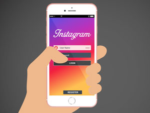
Since the launch of the iPhone and the explosion in popularity of smartphones around the globe, the subject of “mobile-friendliness” in terms of custom app development has been a fluid one. In the early days, it simply meant that an app (or a website, or another piece of rich content) had to look just as good on a small, touch screen device as it did on a large desktop.
As roughly 95% of Americans in the United States now own a cellphone of some kind according to Pew Research Center, it’s clear that this is no longer enough to get the job done. True “mobile-friendliness” needs to go deeper as a concept, not just accounting for what a “smart” device can do but truly taking advantage of it, playing to its strengths and offering an experience that only it and it alone can provide.
Think About How People Use Their Devices When Making Decisions
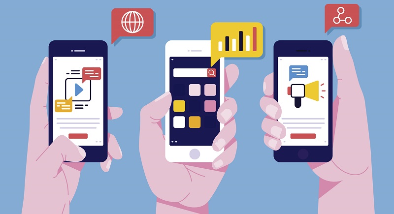
In the modern era, creating mobile-friendly experiences is less about supporting what a mobile device can do and more about supporting what your end users actually WANT to do. While it’s true that there is a certain amount of overlap in these two regards, never underestimate a user’s ability to push their powerful new device to the limits… or at least want to do so.
In that context, everything matters – from layouts to font sizes to buttons and more. This goes well beneath the simple concept of usability. An app that is “usable” is one thing – an app that people WANT to use is something else entirely. Apple’s own internal app development guidelines recommend button sizes of at least 44 by 44 pixels. Apple also has a separate set of recommendations and requirements regarding the font sizes you should be using in various situations, whether you should use the iOS system font “San Francisco” or your own and much, much more. All of these are important to review not only when it comes to making decisions regarding how you express yourself on the platform, but also in terms of how you do so while maintaining maximum legibility.
Goal-Driven Design
One of the most important concepts to understand in terms of what mobile-friendliness means today is that of goal-driven design. Again, it all comes back to not necessarily the app itself but the experience you’re offering to the user.
Think about the people who are going to be using your custom app and always keep two key questions in mind: “What do they want to do?” and “How do they want to be able to do it?” Every decision that you make, from which functionality to include to how to present it, should be dictated by the answers you receive.
Test, Test and Test Some More
Finally, when it comes to unlocking true mobile-friendliness is an app or website, the importance of proper and thorough testing cannot be overstated. Even this concept has changed over time, with the old mantra of “test your app on one mobile device multiple times” being replaced by “test everything, everywhere.”
Every page, every user interaction, every button – they all need to be tested on not just an iPhone, but on each iteration of the iPhone. On Android phones. On Windows phones. Then, they need to be tested again – particularly as new devices are right around the corner. The launch of the new iPhone 8 (or whatever it ends up being called) is still shrouded in secrecy, but one thing is for sure – it will probably look and act differently than most of the iPhones that have come before it.
This means that your custom apps need to essentially be in a constant state of development, making sure that you’re ready to make “behind the scenes” changes as quickly as possible so that you never impede on the rich mobile experience that people have come to embrace.
Employees giving hands and helping colleagues to walk upstairs. Team giving support, growing together. Vector illustration for teamwork, mentorship, cooperation concept
We have published a new cookie policy. It explains what cookies are and how we use them on our site. To learn more about cookies and their benefits, please view our cookie policy.
If you would like to disable cookies on this device, please view our information pages on "How to manage cookies." Please be aware that parts of the site will not function correctly if you disable cookies.
By closing this message, you consent to our use of cookies on this device in accordance with our cookie policy unless you have disabled them.


 In the modern era, creating mobile-friendly experiences is less about supporting what a mobile device can do and more about supporting what your end users actually WANT to do. While it’s true that there is a certain amount of overlap in these two regards, never underestimate a user’s ability to push their powerful new device to the limits… or at least want to do so.


