At this point, it’s no secret that smartphones aren’t going away anytime soon. Since the iPhone exploded onto the marketplace in 2007, the market itself has been surging – Pew Research Center estimated that a full 64% of adults in the United States owned a smartphone of some type by October of 2014. Going beyond the functionality of the devices, this makes a lot of sense – after all, even an entry-level smartphone in 2015 is more powerful than the technology that sent men to the moon in the 1960s. Why wouldn’t you want to carry something like that in your pocket around all day?
However, this has caused a pretty disruptive shift in the way people are consuming digital content. People aren’t just using smartphones with Internet access to supplement their existing online activities – they’re practically replacing them. The website Comscore.com reports that “mobile only” use is on the rise, particularly among the younger generation.
Perhaps the most immediate implication of this falls on Web designers. Simply put, if you’re designing your website or other digital access point with only the traditional desktop experience in mind, you’re going to be looking at a mass exodus of users sooner rather than later for a number of important reasons.
The Problem With Designing Content for the Desktop Experience
It doesn’t take a genius to understand that a smartphone and a desktop computer are not the same thing. The issue is that people are still treating them that way, particularly when it comes to the way websites are designed. A mobile phone has a smaller screen that is controlled by your finger, not a mouse. You could create what is objectively the most stunning website ever created that was optimized for the desktop experience and it would still be a muddled, difficult to use mess on just about any smartphone that you threw at it.
In the early days of smartphone adoption, the “Band-Aid” solution to this was to essentially design two different versions of a site – one for the desktop experience and one for the mobile experience. However, this quickly proved cumbersome and inefficient, so developers began to search for a better way of doing business and retaining users. Thankfully, they found it in responsive Web design.
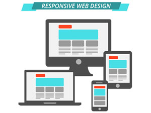
What is Responsive Web Design?
Simply put, responsive Web design is a technology that allows you to design one version of a website that will then automatically optimize itself for whatever device the user happens to be viewing it on. If your user loads your site on a desktop, your site looks great. If they then switch over to their iPhone, the same concept holds true. You only have to do the designing one time and the underlying technology essentially takes care of the rest. Responsive Web design has grown to be so accurate that it can even account for differences in smartphone types. Is your user on a smaller iPhone 4 versus a larger iPhone 6s+? It doesn’t matter – they’re still having a great user experience no matter what.
The Importance of Responsive Web Design
The key benefit that responsive Web design brings to the table is a superior user experience. Studies have shown that people will jump ship almost immediately if they find a site hard to use, even if they know with certainty that site has the information they were looking for. Therefore, responsive Web design allows you to take this experience into consideration, offering up what they’re looking for in the best possible way regardless of certain variables like source device. Responsive Web design also streamlines the development process, allowing you to account for users on various devices without needing to design dozens of versions of the same pages to keep up.
In essence, responsive Web design creates a better Internet experience for people on both sides of the proverbial table – the developers and the users alike. It puts the user experience front and center, allowing people to ingest your content exactly how they want it, whenever they want it. It also takes the burden of trying desperately to stay up-to-date on the hardware specifications of all the latest smartphone and tablet models off of developers’ shoulders, allowing them to focus on the content first and foremost like it should be. Make no mistake: responsive Web design is truly one of the keys to putting your best foot forward on the Internet in 2016 and beyond.
We have published a new cookie policy. It explains what cookies are and how we use them on our site. To learn more about cookies and their benefits, please view our cookie policy.
If you would like to disable cookies on this device, please view our information pages on "How to manage cookies." Please be aware that parts of the site will not function correctly if you disable cookies.
By closing this message, you consent to our use of cookies on this device in accordance with our cookie policy unless you have disabled them.


 However, this has caused a pretty disruptive shift in the way people are consuming digital content. People aren’t just using smartphones with Internet access to supplement their existing online activities – they’re practically replacing them. The website Comscore.com reports that “mobile only” use is on the rise, particularly among the younger generation.


